The system supports user definitions of unlimited number in the form of unique user-defined data collection screens that can be used to record and present specific information about an event. Often, these screens are used in the customer order-entry process to fill out an "order form" on-line.
Once created in the Data Collection Screens option, the screen must be assigned to a template in the Event Template Master if it is an Event/Order type screen.
To create a new screen click "New" from AppWright system setup/Data Collection Screens, input a Screen Name and pick a Screen Type. It is important to use standard (alphabet) characters in the screen name. The options for screen types are shown below.
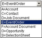
A = Account - Any form used for additional account information input.
C = Contact - Any form or letter that can be attached to a contact person for a vendor or account.
D = Job Document - Any form or letter that needs to be saved with a job in addition to the event screen.
E = Event/Order - The event screen is the main job information screen. It is filled out at the time of scheduling.
F = Account Document - Any form or letter that can be attached to an account or vendor.
O = Opportunity - Any form used for additional information regarding a sales opportunity.
S = Selection Sheet - A sheet that is designed to handle all of your selections/options for a job. It can also calculate pricing and totals as well.
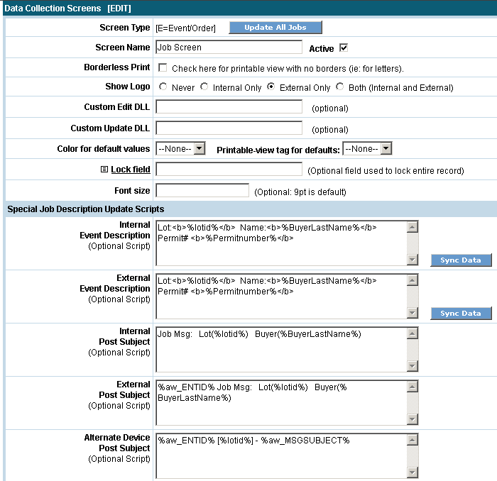
Shown below is an E=Event/Order setup screen. The Internal and External Descriptions are optional, these are very powerful and can be used to customize the descriptions that will show up in the system as well as the job information that the customer wants to see in the Worklist. Things such as the name of the customer, job status, permit numbers, address and many other things can be placed in the description.
Click
the  button
to add
the screen.
button
to add
the screen.
Once
the screen is created, choose  to
fill in the fields.
to
fill in the fields.
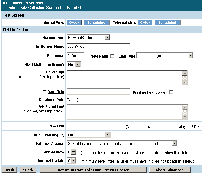
Field Definition
Sequence
Determines the order of the fields on the screen.
New Page
If checked, a new screen will appear with this field being the first field on it.
Line Type
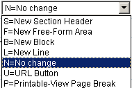 There
are 7 ways to use this field on the screen.
There
are 7 ways to use this field on the screen.
S = New Section Header will cause the Text/Description to appear in a colored block as a heading.
F = Free Form Area will make the field left justified as an edit box.
B = New Block allows the input of text to appear in a left column while the field will appear in a right side column.
L = New Line will leave the field within the same block but move it to a new line.
N = No Change will put the field on the same line as the previous field.
U = URL Button allows a link to a web page to be added.
P = Printable-View Page Break will allow you to add a page break for printing purposes with a heading at the top of every page. For example, a page number or a Lot ID can be printed at the top of every page of the form.
Start Multi-Line Group?
Multi-line groups can be used for information that needs to be entered for the same fields but multiple times. For example, if fields are set up to allow for entries for options for a bathroom and there are four bathrooms, a field can be designated to enter the number of bathrooms and all the data fields will display four times. If yes is chosen here, the additional fields shown below will appear.
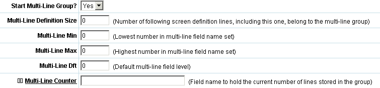
Multi-Line Definition Size
This number represents how many fields are included in this group. If there are five fields to enter bathroom selections into then five would be entered here.
Multi-Line Min, Multi-Line Max
The minimum and maximum number of groups that can be added to the screen. In this case the minimum is one and the maximum is four since there are four bathrooms.
Multi-Line Dft
Indicate what the default number should be, meaning there will always be at least one bathroom so one would be the default number filled in.
Multi-Line Counter
Select the name of the screen field that the count will be entered into to reflect how many multi-line groups should be added to the screen.
Field Prompt
Text from this field will appear in front of the field. Basic HTML is used here to create tables, begin rows and cells, bold text etc.
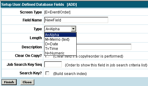
Data Field
Use the link to select a field from the
database that will be used to store this information or to add a new field
to the database. The
data fields are created in the user defined database area or by clicking
the  button to add a new field. The
Fieldname is where the name of
the new field is defined. It
must begin with an alpha character and cannot contain spaces. Next
select the Type of field you are
creating. If
this is a numeric field then the number of decimal places must be entered
as well. The
Length of the field is entered
next followed by a Description.
The description
can be displayed in dropdown boxes and search places. Clear On Copy
button to add a new field. The
Fieldname is where the name of
the new field is defined. It
must begin with an alpha character and cannot contain spaces. Next
select the Type of field you are
creating. If
this is a numeric field then the number of decimal places must be entered
as well. The
Length of the field is entered
next followed by a Description.
The description
can be displayed in dropdown boxes and search places. Clear On Copy
If this field will be included in search
dropdown selection boxes then a number must be entered in the Job
Search Key Seq field to decide in what place this field will come
in the dropdown box. Search
Key Click
the button when complete.
If new fields are created, the database
must be regenerated to add the new fields to the database. This
is done by clicking the  from the data collection screen
field list and then the
from the data collection screen
field list and then the  button. The
system will show you a list of the changes that will be made to the database
when the
button. The
system will show you a list of the changes that will be made to the database
when the  button is selected.
Print no field border
If this is checked this field will not appear as text in a box when printed but just as the text.
Database Defn
Shows basic information about the Data Field that was chosen.
Additional Text
Text from here will appear after the field. Basic HTML is used here to close tables, rows and cells.
PDA Text
Conditional Display
This setting will allow the field to show on the data collection screen based on certain "rules". Job tasks, alpha fields, numeric fields, date fields can have these rules applied to them. For example, a field can be set to only show up on the data collection screen if a task is complete. A box will show up to allow you to define which job task or field the condition is being based on.
External Access
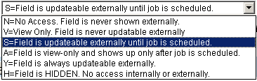 This option controls the limit of what the external user
can do with the field.
This option controls the limit of what the external user
can do with the field.
N = None - Cannot see the field at all.
V = View Only - Can view but not modify.
S = Update Until Scheduled - Is modifiable if order hasn't been scheduled.
A = Field is view-only and shows up only after job is scheduled.
Y = Always - Can be updated at any point.
H = Hidden - Field is hidden. No access internally or externally.
Internal View
Enter the level internal users must have in order to view this field. This setting could be used for anything where certain users should not view the information displayed in the field. An internal user's level is defined on their User setup screen.
Internal Update
Enter the level internal users must have in order to update this field. This setting could be used for any field where only certain users should be able to edit or update the contents of the field. An internal user's level is defined on their User setup screen.
Click the button and the
system will let you know the database definition has been updated. At
this point you have the option of adding some additional information.

Required
Checking this box mandates input for this field before leaving the screen. If the user does not fill out a field when this option is selected, an error message will appear at the top of the form and also under the field to let them know what they need to do.
Refresh on change?
If this is checked then the screen will refresh after entry into this field.
Update Button Text
This will put an update button on the screen labeled with the text entered here. The screen will refresh or "update" when the button is clicked.

Size
The maximum input length is the amount of characters that will be allowed in the field. The size of the display field is the length of the input box that is shown on the data collection screen and will be single row only. The size cannot exceed the length of the data field chosen above.
Choice Type
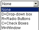 This option has four
types of boxes to choose from.
This option has four
types of boxes to choose from.
D = Dropdown box is the style of this field.
R = Radio buttons are good for yes/no situations.
C = Check boxes are used when there are multiple selections to choose from or check off.
W = Window will pop-up a new window to allow for selection of choices from a table or list of resources.
Choices per line
This will determine how many radio buttons or check boxes are in a row.
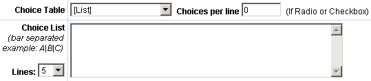
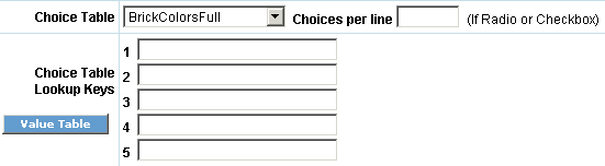
Choice Table
If a Screen Value Table is being used to supply the data then the table is selected here. Instead of the Choice List field you will see a place to enter the lookup keys that will allow for the correct data to be returned from a screen value table. See the heading on Screen Value Tables for more information on creating these.
Choice List
Input the values here that will be used for selection in the check boxes or dropdown box. Separate your choices with a | (bar). If you would like a blank option to appear at the top of the selection list in the dropdown box, place a bar in the beginning of the value. For example: |One|Two|Three will have a drop down box with a blank at the top, then One, Two, Three as opposed to One|Two|Three which will have One as the first entry in the drop box.

Text Area
If no choices are made for the choice type option then the text area allows you to override the size of display field and create an input area with multiple rows. Input the amount of characters across in Columns and the number of lines down in the Rows. Generally a good setting will be 90 columns and 4 rows.
Default Value
This will hold the value to be defaulted into a field. The first time the page appears this value will be placed into it. It can be overridden during input.
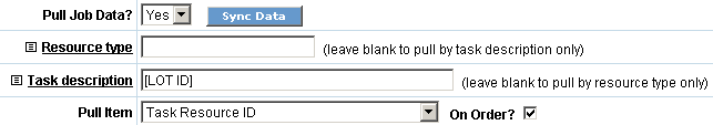
Pull Job Data?
The data that is to be entered into the new field can also be pulled into the screen instead of it being entered. By saying Yes to 'Pull Job Data?' you can then specify which task the data should come from as well as options such as the name of the resource or the date the task was completed.
Click the button when done
to complete.
As you add fields, check the progress of the screen by using the buttons at the top of the screen. The buttons allow you to view the data collection page from many vantage points. The Order button will show you how the page will look when in the order mode. The Scheduled button will show you how the page looks once it has been scheduled. These views are good to see how certain fields become unchangeable or not viewable.

From the list of fields in the data collection screen you also have the option of viewing the screen to check the progression of any changes that are being made with the Test:Int and Test:Ext buttons. By placing a checkmark next to several fields, you can edit, copy or delete the fields all at one time by selecting the action in the Checked Item Action dropdown and hitting the Go button. Renumber will renumber the sequence number of the fields by 10's. The HTML View button will toggle with Std View to display the list of fields with the HTML for each versus information about the fields. Direct access to the database fields themselves can be done through the Define DB button.

If you are making a lot of changes to a screen already in use, it is better to copy it to a “test” screen name and work on it there. When done, delete the original and rename the “test” screen back to the original name.
Basic HTML
The following HTML is a very basic list used most when creating screens:
<table> </table> - This will open and close a table. A table can contain several rows and cells. A table can also contain the definitions for the spacing and padding of the cells contained in the table.
<tr> </tr> - This will begin a new row and end the row.
<td> </td> - This will open a new cell and close it. A cell can contain formatting commands for alignment or font size. Example: <td align = center><font size = 2>
<b> </b> - This would be used before and after text to make it appear in bold. Example: <b>This is bold text.</b>
<u> </u> - This will underline the text. Example: <u>This text will be underlined.</u>
<br> - This signifies a break. Usually it is used to make the text and the database field appear with the text on top of the database field. If no break is used then the database field will directly follow the text.
- Represents a non-break space. For example, the text to be displayed is 'Home Buyer's Name'. To ensure that all three words are displayed together and not split due to the size of a cell it would be typed as 'Home Buyer's Name'.